


Moog Minimoog brochure entitled 'The INstrument of the Pros...' from 1972.
Do not adjust your television set... (or in this case, computer monitor). Bright red, pink and yellow really were the colours Moog chose for this four-page brochure.
When this brochure was designed and printed in 1972, Moog's Minimoog had only been out for a year or two and the compact synthesizer market was far from saturated. Most synthesizer's keyboards were still considered more of an attachment or accessory. :o)
The Minimoog did have some competition around this time. The ARP Odyssey and the EML ElectroComp 101 were about to launch, if they hadn't already. But the ElectroComp 500 and Roland SH-1000 were still a year or so away.
So, why did Moog go so crazy with the colours of this brochure?
Well, Moog didn't go 'completely' crazy. In fact, those colours were quite 'IN' at the time. Just like the tagline Moog used on the cover of this brochure - 'The INstrument of the PROs...'.
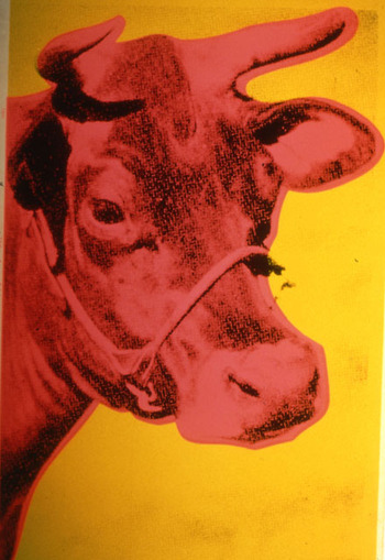
Bright, strong colours were really hot in 1972. You just have to look at Andy Warhol's Red Cow or Mao Tse-tung to see how splashes of colour were being applied over top of black and white images.
The designer used a similar technique to punch up the excitement in what would otherwise be a pretty sedate brochure. On the front cover, the colours are used as a candy-striped backdrop, a popular design element at the time. On the inside pages, the vibrant yellow and pink lines draw your eye through a collection of smaller, random black and white images. The lines are the only reason those photos can be tied together to create a balanced frame for the large central photo of the Minimoog in all it's glory.
If you don't believe me about the trend in colors, you just have to look back at your childhood set crayons. 1972 was the year, according to Wikipedia's Crayola Crayons page, that eight fluorescent colors were introduced into their crayon box, including 'Shocking Pink' and 'Laser Lemon' (renamed Ultra Pink and Chartreuse in 1990).
So, the brochure was really just playing into the design and creative style of the day.
And the exuberant creativity of the pop culture era was translated into the ad-copy as well. Take a look at that first paragraph:
"Brutal, caustic, volcanic - Evocative, flirting, caressing - Crisp, powerful, biting - Entrancing, embracing, exhilarating! Extend the stuff your music is made of with the MINIMOOG, a true Moog synthesizer which opens exciting new dimensions of expression to the creative professional. "Really? Caustic...? Caressing...? Embracing...? Wow. Crazy stuff.
So, bring all that creativity and brash optimism together, and then on top of that, mix in the pre-clip-art artwork of that little, gentlemanly, 'well-bred' composer dude that pops up four or five times, and how could someone in 1972 not be inspired?
And/Or confused. :o)
BTW, it would be another five years or so before the Sex Pistols would jump on the hot-pink bandwagon with their shocking pink and yellow (or pink and green, depending on where you live) cover for the album 'Never Mind the Bollocks'.
1 comment:
Hi! First of all, I literally love your blog! I discovered it because I was working on my graduation thesis (long story short it's all about synth and jazz) and I was going all over the internet for my research. The images are soo beautiful and your comments are so interesting, brilliant and funny!
I'm reaching out to you because I would like to print the second page of this brochure to make it a poster for my room. And I'd like to make it big so I need a better quality file. The pdf doesn't open up.. Would it be possible to send me a tiff or a better quality version? Thank you so much in advance and good luck!
Post a Comment