
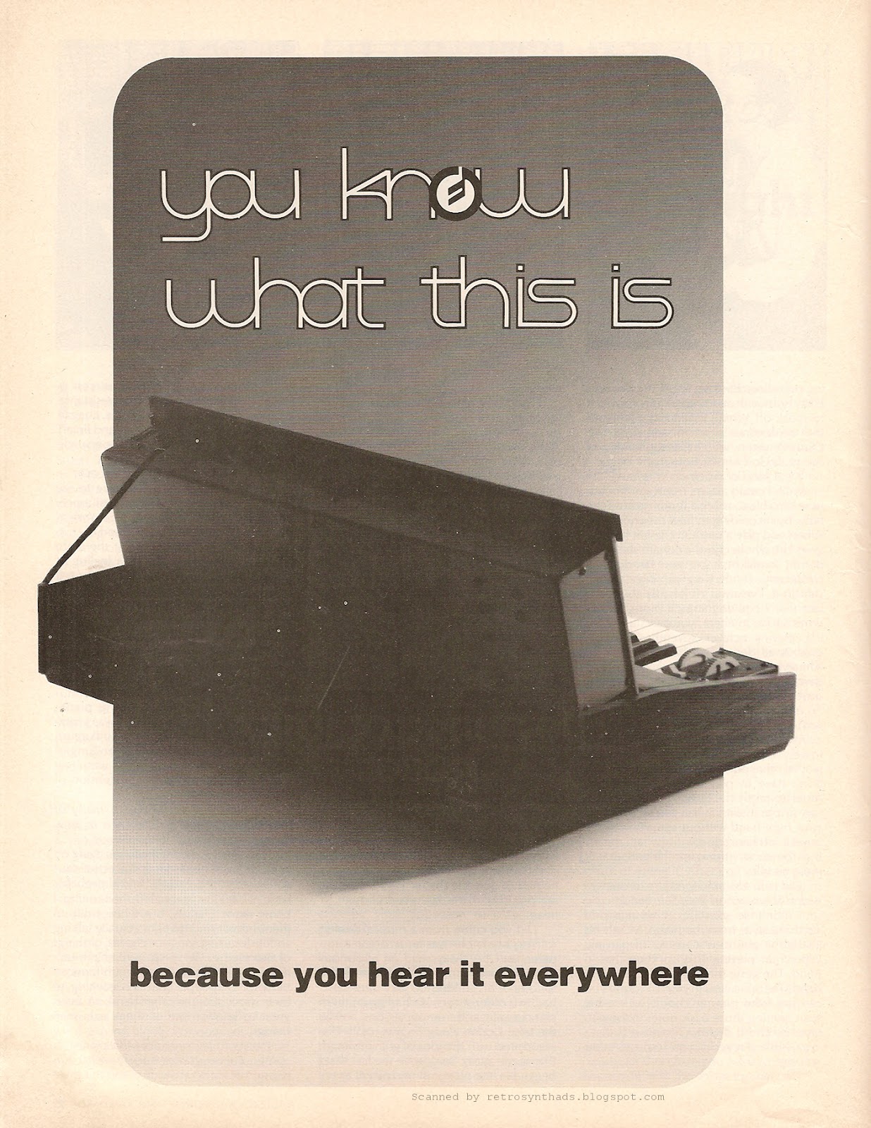
Moog Minimoog "You know what this is..." full page black and white updated advertisement from page 26 in the August 1979 issue of Contemporary Keyboard.
Finger is healing nicely, thank you very much for asking. I gotta tell you though, its a pain in the ass to type properly.
My left middle finger has slowly taken on the role of R, T, F, G, V, 5, 6, 7 on the keyboard, but I'm still constantly hitting the back-space to fix spelling mistakes. And all my passwords contain at least two special characters, so I'm constantly locking myself out of my computers at work because our IT department insists (rightly so) to have that three-strikes rule. Gah!
Luckily, I came across this totally ***new*** Minimoog ad, and since I've yapped about the Mini in a number of other blog posts, I can keep this one short, and hopefully spelling-mistake-free.
What? You've seen this ad on my blog? Maybe more than once already?
Nope. Totally different. Like, totally.
You may be referring to the July 1979 "You know what this is..." ad that appeared in CK a month earlier and that I posted two years ago. I've included it below, along side this totally new and improved August 1979 "You know what this is..." ad:

:)
Okay, time to come clean.
I'm embarrassed to say that even though I'm constantly flipping through old issues of CK, I missed this new and improved version of the original ad.
The original ad was "clever and confident" (as translucent_nick commented under the original ad), but side by side, you can really see how a few small details can take this ad to the next level. Literally finished the job. It's like the designer knew he/she hadn't gone the distance the first time around and decided to throw CK the new version for the following month before his boss found out what happened. Not that it's ever happened to me or anything...
In particular, I'm talking about the darker fading background that really enhances the ad-title, and the addition of the the little Moog symbol in the "o" of "know". Moog usually reserved that symbol for using in the first "o" in the company name "Moog" and in names of their synths - Multimoog, Polymoog, etc. Being so clever, the designer (or someone else) figured that since the name of the company or synth doesn't appear in the ad, they could use the symbol in the ad-title to help keep the brand presence.
A nice touch, although someone could make the argument that the outline of the Minimoog itself is enough of a brand cue.
Moog continued to improve upon the general theme and confidence found in those black and white ads when they created their next one for inclusion in the September 1979 issue of CK. Along with a good dose of colour.
Its gotta be close to the perfect ad.

Yum.
No comments:
Post a Comment